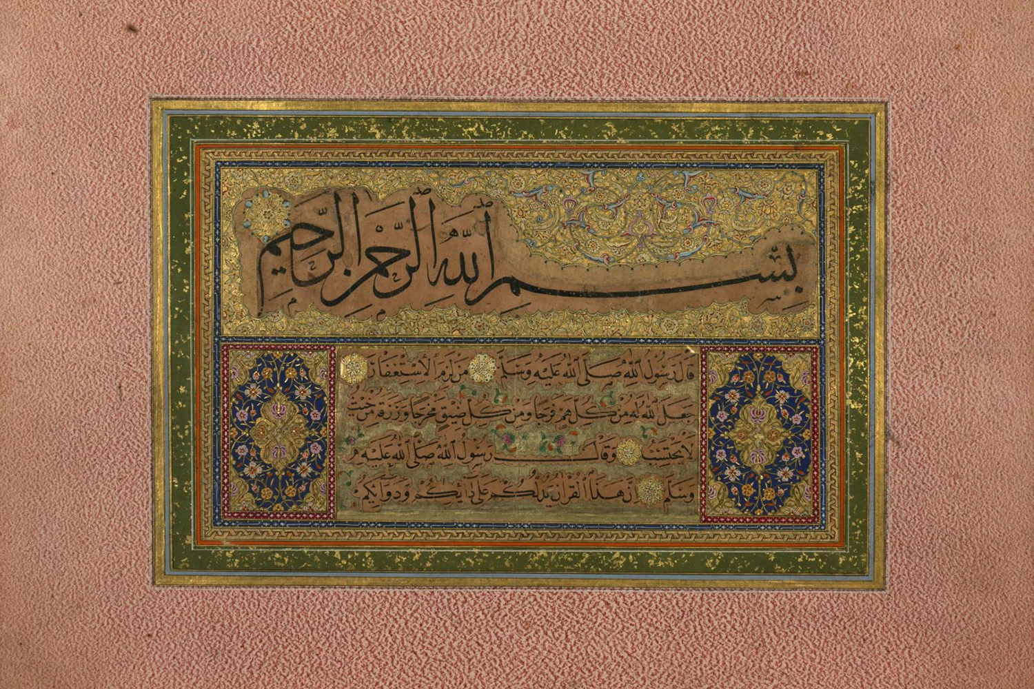
From Kufic to Contemporary: The Evolution of Arabic Calligraphy
How a handful of scripts, shaped over fourteen centuries by scribes and master calligraphers, became one of the richest visual languages in the world, and how designers put it to work today.
On this page
Few art forms have travelled as far, or changed as much while staying recognisably themselves, as Arabic calligraphy. The same twenty-eight letters have been carved into stone, woven into silk, painted onto tiles and, today, drawn as vectors that scale from a phone screen to the side of a building.
This guide walks through the major scripts in roughly the order they appeared, what makes each one distinctive, and how to choose between them when you are designing something of your own.
Why the written word became the art
In Islamic culture, writing has always carried a particular weight. The Qur'an was revealed as spoken word and preserved in writing, so copying it beautifully became an act of devotion, and the scribe's craft rose to become the most respected of the visual arts.
That status explains why calligraphy turns up almost everywhere in Islamic art: across the pages of manuscripts, around the domes and doorways of mosques, on coins, ceramics, metalwork and textiles. Letters were not decoration added to an object. Very often they were the decoration.
Kufic: geometry before flow
Kufic, named after the city of Kufa in present-day Iraq, is the oldest of the great scripts. It dominated Qur'an manuscripts from roughly the eighth to the tenth century, and its character is unmistakable: angular strokes, a strong horizontal baseline and letters that are wide and low rather than tall.
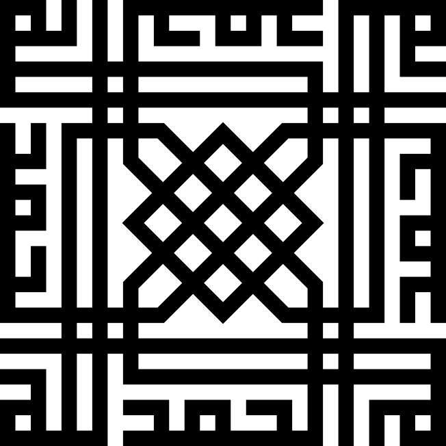
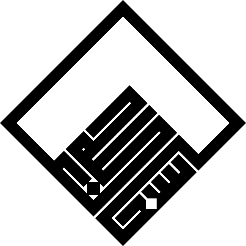
Over time Kufic branched into a remarkable family. Foliated and floriated Kufic grew leaves and tendrils from the tips of letters. Square Kufic went the other way, reducing every stroke to a grid so that whole phrases could be built from straight segments, much like a mosaic. It is the reason sacred names can be read in the brickwork and tiles of buildings across Iran and Central Asia.
Ibn Muqla and the rules of proportion
The turning point came in tenth-century Baghdad. Ibn Muqla, a vizier of the Abbasid court and a gifted calligrapher, set out a system of proportioned writing that made beauty measurable.
- The unit of measure was the rhombic dot, the diamond-shaped mark left by pressing the reed pen once onto paper.
- The alif, the first letter, was given a fixed height counted in dots, and became the diameter of a circle that every other letter was sized against.
- Each script had its own numbers, so a trained hand could reproduce it consistently, letter after letter and page after page.
Later masters refined the system. Ibn al-Bawwab polished it in the early eleventh century, and Yaqut al-Musta'simi, working in the thirteenth, is remembered for cutting the reed pen at an angle and giving the strokes their elegant taper. Together they fixed the canon known as the Six Pens: Thuluth, Naskh, Muhaqqaq, Rayhani, Tawqi and Riqa.
Naskh and Thuluth: the everyday and the monumental
Naskh became the workhorse. Small, rounded and supremely clear, it was the script of choice for copying books and, eventually, the Qur'an itself. Almost every Arabic typeface you read on a screen today descends from it.
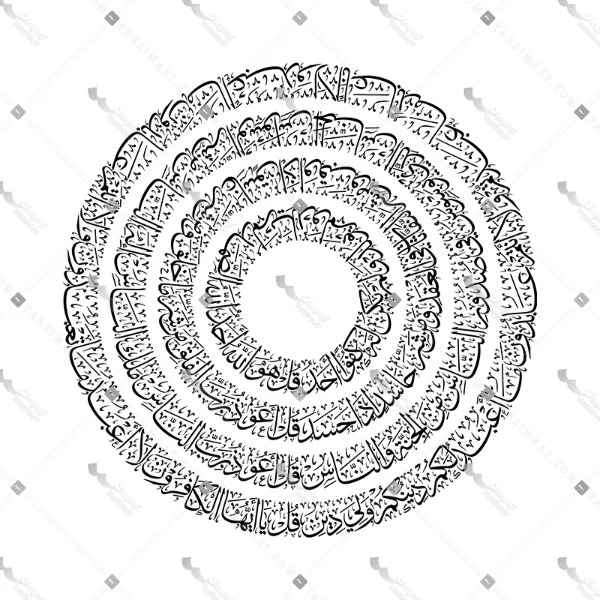
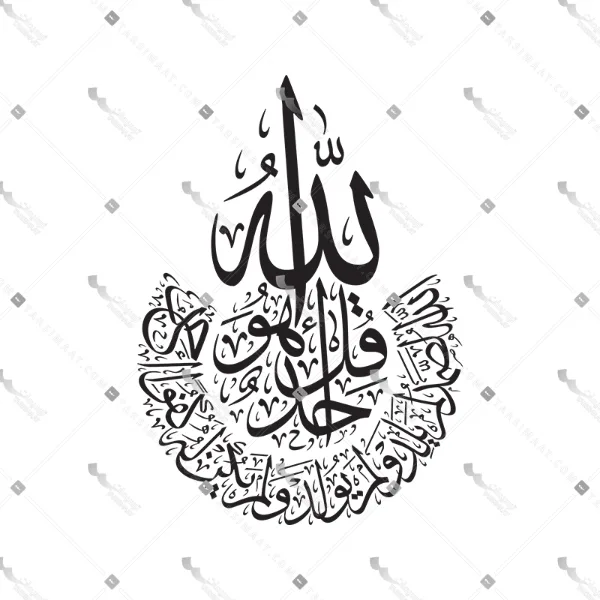
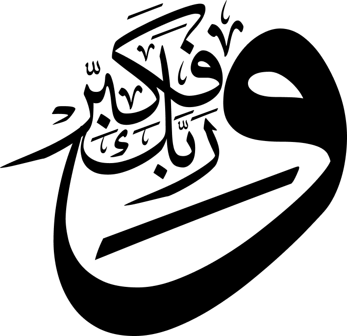
Thuluth, whose name means "one third", is its ceremonial sibling. Tall verticals, deep sweeping curves and letters stacked in layers give it a sense of architecture, which is exactly where it ended up: in chapter headings, on monumental inscriptions and around the interiors of mosques.
Every Thuluth composition is a negotiation between legibility and rhythm: each letter has to read, and the whole has to move.
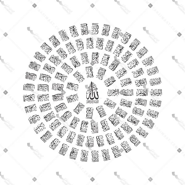
Because a Thuluth piece is composed rather than simply written, no two compositions of the same verse look alike. The calligrapher decides which letters to stretch, where to stack, and how to fill the space with vowel marks and small ornaments until the block feels balanced.
Nastaliq and Diwani: the Persian and Ottoman hands
Nastaliq took shape in Iran in the fourteenth and fifteenth centuries, and tradition credits its codification to Mir Ali Tabrizi. Its words seem to hang from an invisible line and slide gently downward from right to left, with long, light horizontal strokes. Often called the "bride of calligraphic scripts", it became the natural home of Persian poetry, and masters such as Mir Emad carried it to a peak in the seventeenth century.
Diwani grew up at the Ottoman court in the sixteenth century as a chancery script for decrees and official documents. Its letters flow tightly into one another, which made it beautiful and, usefully, very hard to forge.
The scripts at a glance
| Script | Emerged | Character | Works best for |
|---|---|---|---|
| Kufic | 8th–10th c., Iraq | Angular, horizontal, geometric | Logos, patterns, architectural grids |
| Naskh | 10th c., Baghdad | Rounded, compact, highly legible | Body text, books, typefaces |
| Thuluth | 10th–13th c., Baghdad | Monumental curves, stacked layers | Headlines, wall art, inscriptions |
| Nastaliq | 14th–15th c., Iran | Hanging, sweeping, airy | Poetry, invitations, editorial |
| Diwani | 16th c., Ottoman court | Dense, flowing, ornamental | Seals, certificates, luxury brands |
Calligraphy in contemporary design
In the twentieth century, artists across the Arab world and Iran began to treat letters as pure form. The movement known as Hurufiyya, and in Iran the Saqqakhaneh school, brought calligraphy into painting and sculpture, sometimes dissolving words until only their rhythm remained.
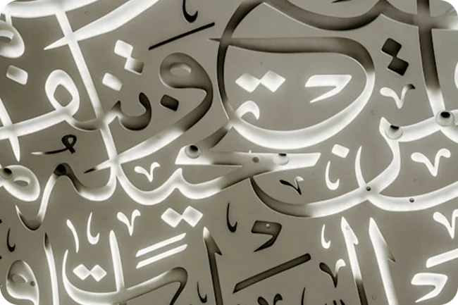
Today the tradition lives in a new medium. Vector files let a single composition work on a business card, a mosque's signage, a product label and a mural without losing a hair of detail. Brands use calligraphy to signal heritage; interior designers use it as a focal point; and digital creators animate it, letter by letter.
Start from where the piece will live. Thuluth and Kufic hold their own at a distance; Naskh stays readable at small sizes; Nastaliq rewards close viewing. And when the text is sacred, place it with respect: keep it off floors, footwear and anything made to be thrown away.
A living tradition
From the first angular Kufic Qur'ans to vector artwork on today's screens, Arabic calligraphy has never stood still. Each generation has inherited the rules, mastered them, and then found something new to say within them. That is what keeps it alive, and why it continues to inspire designers far beyond the Islamic world.
If you would like to work with these scripts yourself, every design in the Tarsimaat store comes as editable vectors and high-resolution images, ready for print, product and screen. And for something made only for you, our studio takes on custom calligraphy commissions.