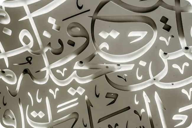
Types of Arabic Calligraphy: A Guide to Seven Major Scripts
Discover the differences between Kufic, Naskh, Thuluth, Nastaliq, Diwani, Ruqah and Maghribi, with practical guidance for choosing calligraphy for your next design.
On this page
- Understanding scripts, languages and fonts
- 1. Kufic: angular forms and strong structure
- 2. Naskh: rounded forms and a clear reading line
- 3. Thuluth: prominent verticals and expressive compositions
- 4. Nastaliq: sweeping curves and descending movement
- 5. Diwani: intricate connections and rising lines
- 6. Ruqah: compact, practical handwriting
- 7. Maghribi: traditions of the western Islamic world
- How to choose the right calligraphy for your project
Arabic calligraphy takes many forms. Some scripts build their character through angular shapes and strong horizontal lines. Others use rounded letters, tall vertical strokes or sweeping arrangements that descend across the page.
Understanding these differences helps you recognize the artwork you encounter and choose a suitable direction for your own project. A script used for a long manuscript page may create a very different reading experience from one composed as a short architectural inscription.
This guide introduces seven major calligraphic styles found across Arabic, Persian and Ottoman traditions, explaining their visual features and what to consider when using them in design.
Understanding scripts, languages and fonts
In calligraphy, a script is a recognized style of writing with its own letterforms and conventions. A language is what the words communicate. A font is a digital tool for setting text.
These distinctions are particularly useful when discussing Nastaliq. It developed in the Persian tradition, within the Arabic-derived writing system, and is especially associated with Persian and Urdu. It can also be used for Arabic text.
A finished calligraphic composition is another consideration. Its letters and words have been arranged for a particular text and shape. Typing the same phrase in a font will not automatically recreate that arrangement.
1. Kufic: angular forms and strong structure
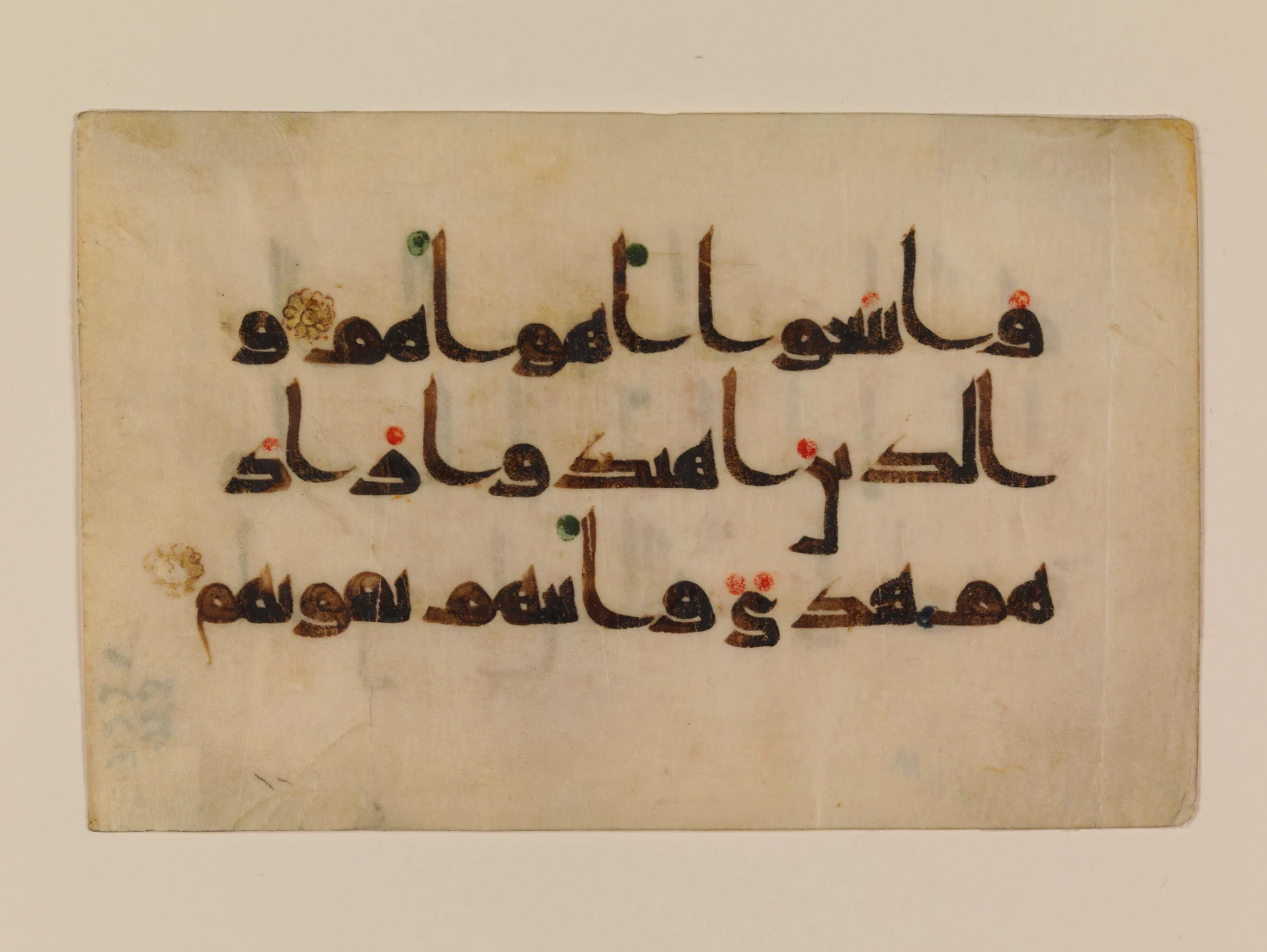
9th–early 10th-century Qur'an folio
Kufic is a broad designation associated with early Arabic manuscript writing and later ornamental forms. Its name refers to Kufa in Iraq, although that name should not be treated as proof that every variant originated there.
Many examples feature angular letters and a strong horizontal structure. The tradition includes considerable variation, from manuscript forms to elaborate ornamental treatments.
Square Kufic is a distinct geometric approach that arranges writing on a rectilinear grid. Its relationship with geometry can make it especially interesting for architectural and grid-based designs.
When choosing a Kufic composition, verify the wording as carefully as the visual structure. A successful geometric pattern still needs to preserve the intended text.
2. Naskh: rounded forms and a clear reading line
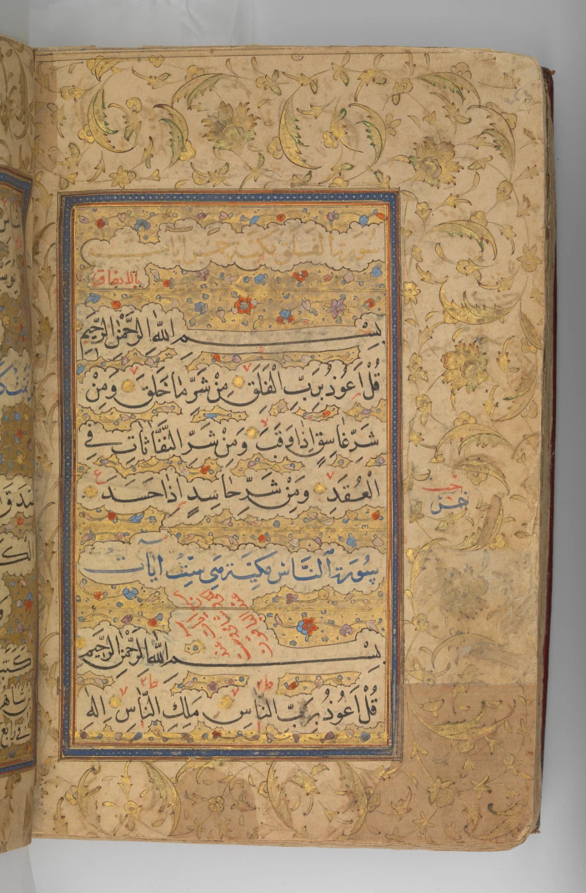
Qur'an of Ibrahim Sultan, 1427
Naskh is a rounded, proportioned script closely associated with book production and Quran manuscripts. Its organization has also influenced Arabic typography.
Compared with many dense display compositions, Naskh often presents a more regular line and a continuous reading experience. Look at how letters connect, how words are separated and how consistently the writing moves across the page.
For projects containing substantial text, Naskh is a useful direction to explore. Readability still depends on the quality of the writing or font, its size and the surrounding layout.
3. Thuluth: prominent verticals and expressive compositions
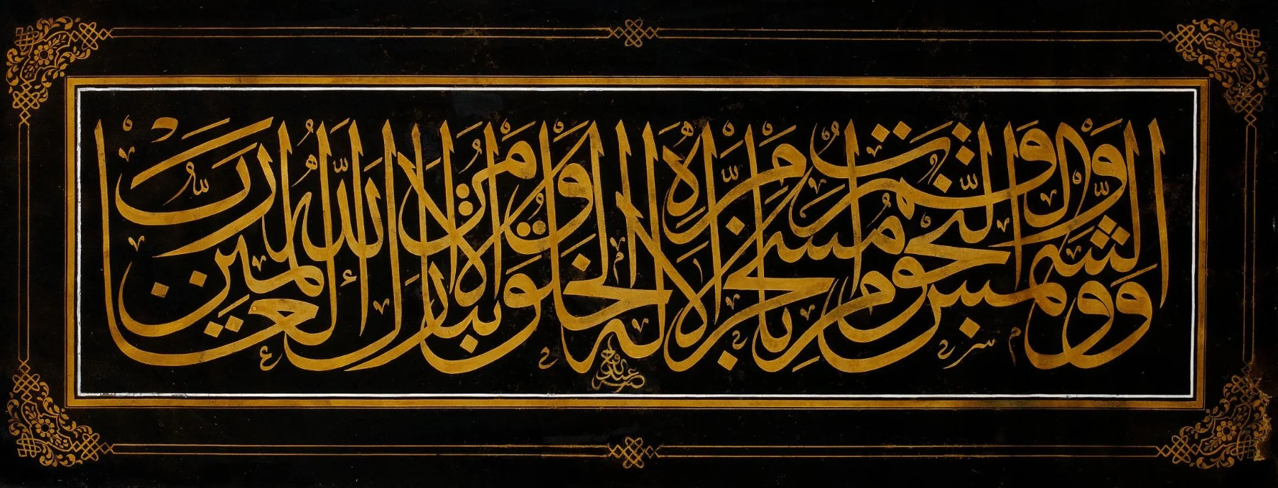
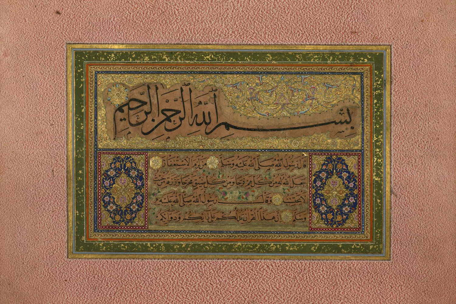
Ottoman calligraphic panel, second half of the 19th century
Thuluth is recognizable through its upright strokes, curved forms and potential for interlaced arrangements. Historical applications include titles and architectural inscriptions.
Its structure gives calligraphers considerable scope to arrange a short text into a distinctive overall shape. A broad horizontal composition and a compact roundel can feel very different, even when both use Thuluth.
For design, examine the artwork’s outline as well as its individual letters. Consider how its tallest strokes and densest areas will relate to the space around it.
4. Nastaliq: sweeping curves and descending movement
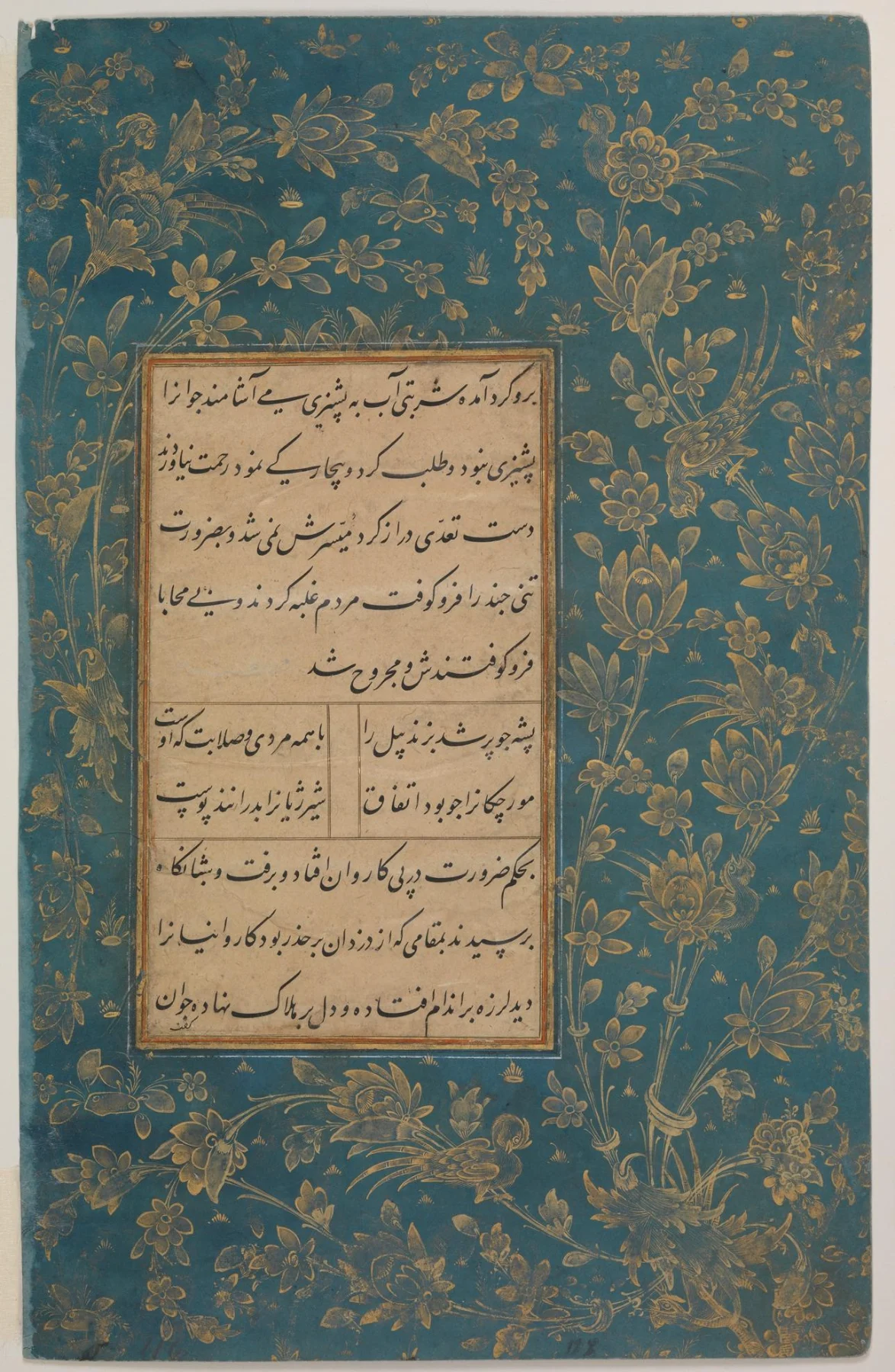
Poetry by Sa'di and Hafiz, late 15th century
Nastaliq developed in Iran in the fourteenth century and became closely associated with Persian literary culture, including poetry and calligraphic album pages.
Look for short vertical strokes, broad curves and groups of letters that appear to descend across the composition. This placement can give the writing a distinctive hanging rhythm.
The surrounding space is an important part of its presentation. Tight cropping can interrupt extended strokes or conceal the movement between groups of words.
When placing Nastaliq in an editorial layout or artwork, allow its arrangement to guide the space you give it.
5. Diwani: intricate connections and rising lines
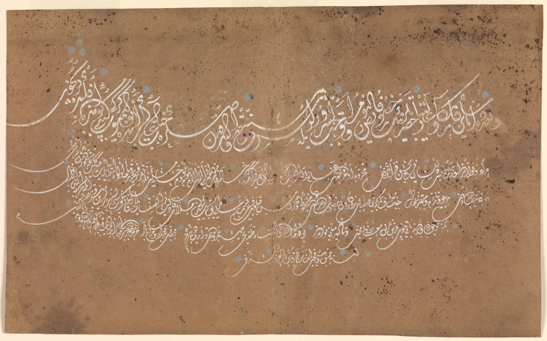
Ottoman calligraphy, dated 1664–65
Diwani, also spelled Divani, developed in the Ottoman court for official documents. Its forms can include closely connected letters and rising arrangements. Jali Diwani introduces particularly elaborate decorative treatment.
The level of detail matters when choosing a piece for reproduction. An intricate composition may work well as a large focal point while becoming difficult to distinguish at a smaller size.
Always compare the artwork at the dimensions you intend to use. Pay attention to the spaces between letters and the distinction between meaningful marks and ornament.
6. Ruqah: compact, practical handwriting
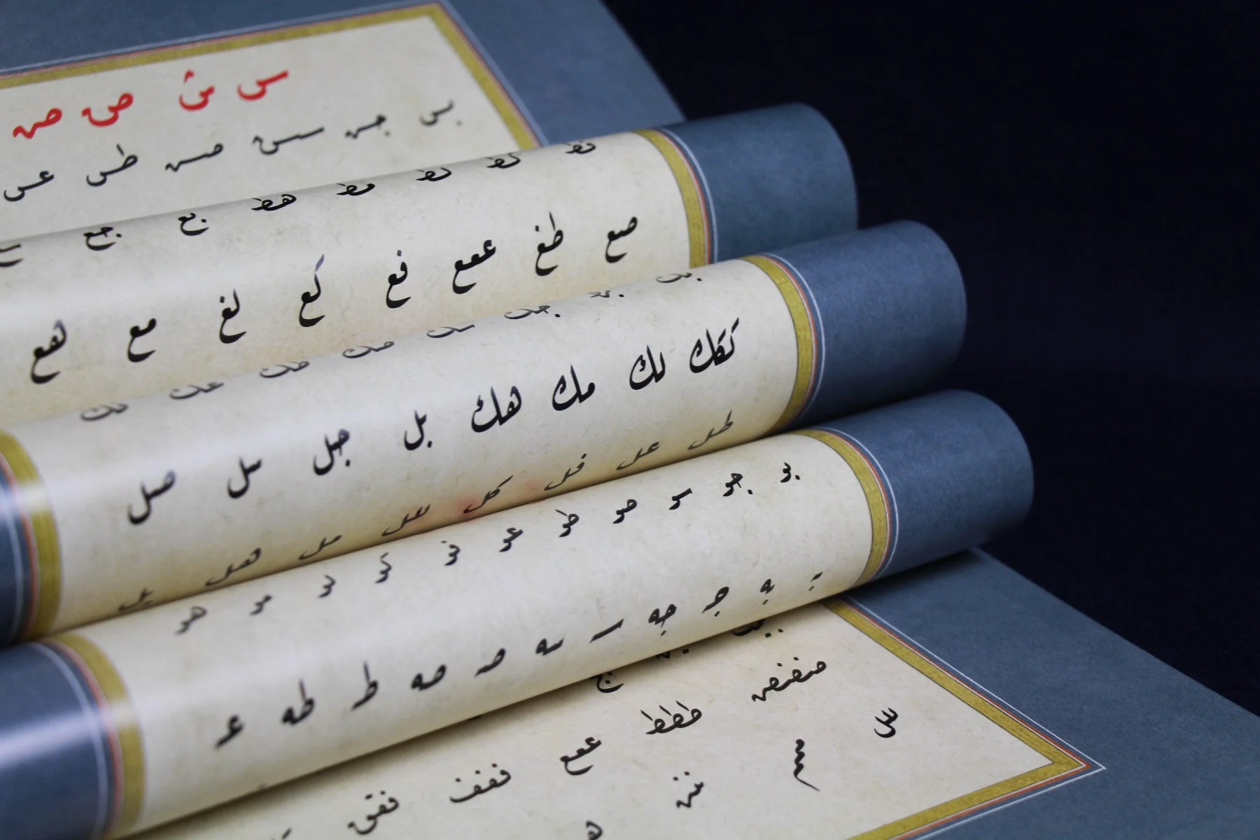
Traditional Ruq'ah handwriting exercises
Ruqah, also written Ruq’ah, is associated with everyday handwriting and practical correspondence. Its compact forms and short strokes support efficient writing.
It should be distinguished from the historical Riqa script included in the classical Six Pens. Similar English spellings sometimes make the two easy to confuse.
Studying Ruqah helps build an understanding of everyday handwritten Arabic. When selecting it for a design, consider how its compact, handwritten character relates to the project’s purpose.
7. Maghribi: traditions of the western Islamic world
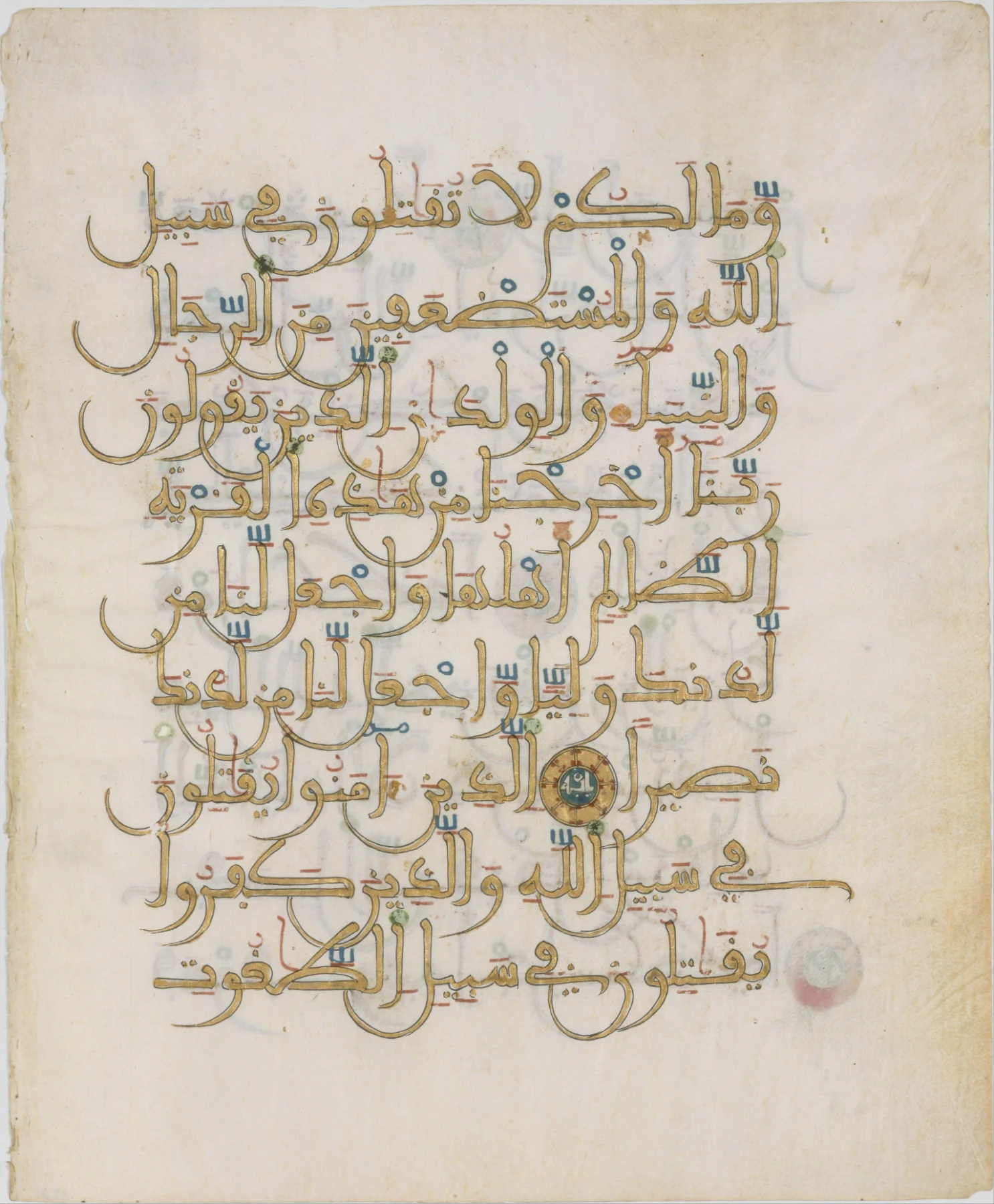
North African Qur'an folio, circa 1250–1300
Maghribi refers to a family of writing traditions associated with the western Islamic world, particularly North Africa and historical al-Andalus.
Examples can feature broad, rounded descending forms and conventions that differ from those familiar in eastern scripts. The exact characteristics depend on the particular tradition and example.
Its regional background deserves attention. For cultural projects, understanding the origin of the selected work helps you use it with greater accuracy and purpose.
How to choose the right calligraphy for your project
Begin with the words. Identify the language, confirm the wording and decide how the audience will encounter the text.
Next, consider the format. A wall inscription, invitation, book cover and website header provide different amounts of space and different reading conditions.
Compare actual compositions at their intended size. Check fine strokes, dots and narrow gaps after reducing the artwork. Give supporting information, such as dates or explanations, its own clear place in the layout.
For sacred text, have the wording, attribution and intended placement reviewed by someone knowledgeable about the context.
You can explore Tarsimaat’s calligraphy collection to compare available compositions, or contact the studio about a particular phrase or arrangement.